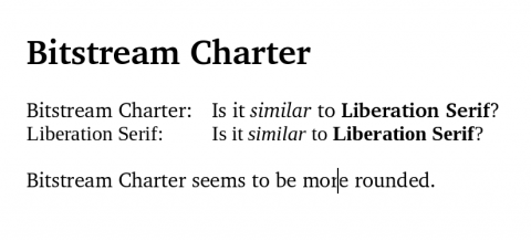
Bitstream Charter is a glyphic serif typeface designed by Matthew Carter which I discovered only recently in Ubuntu 8.10 (it ships with X11). It is definitely one of the most beautiful serif fonts that I have ever seen. At first sight it looks similar to Liberation Serif but is more rounded and easier to read.

Always felt a bit wide to me, though I’m generally a fan of Matthew Carter.
Matt, that’s interesting. I think my love for wider type comes from fixed-width Corier New, which I use for getting the actual writing done. One font that is definitely too wide even for me is Georgia (also by Matthew) set in bold.
In contrast, Verdana seems to be the best sans-serif for the web — it has that spacey look and is so fast for skimming, while Arial (and even Helvetica) seem to be too packed.
Yes Bold Georgia never appealed to me, but Georgia at larger sizes and normal weight it’s divine. (You can tell we like this on WordPress.com.)
Matt, I think that Georgia has actually become a significant part of the WordPress brand — it is one of the elements used consistently together with the logo (W) and the color scheme across all sites (and even the backend).