Update: this mock-up has now been turned into a fully functional interface.
In the previous post I stated that the proposed vertical navigation bar for WordPress 2.7 Dashboard is not the best solution for the purpose that it is going to be used for. And just because there should be a reason why most of the desktop applications have their main navigation placed at the top as a drop-down menu, right.
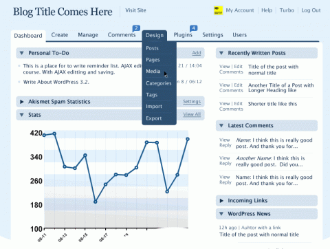
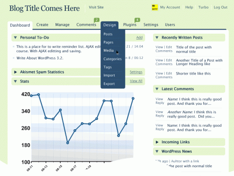
Here is a quick mock-up of the design that, I think, would be much easier to use.
Standard Functionality and Design
Notice how all the Dashboard elements use the same expandable/collapsible boxes. By applying the two column model and the idea of left side column containing the content and the right side column containing the action, one could easily come up with a standard set of design templates and system hooks that would allow greater expandability and customization of the whole backend.
The Write Post page would have text inputs in the content column while users would be able to reorder and place action widgets either bellow the post (as it currently is since WordPress 2.5) or in the action column.
This idea was also detailed in the description of the WordPress design prototype 1.1 (.pdf, page 7).
The Javascript side for the drag-and-drop interface elements has already been created by the amazing folks of jQuery — view demo.
Design Decisions
What would you like to see on the front Dashboard which opens when you log in? What are the first tasks that you usually do apart from writing a new post?


Wow, I really like the dashboards.
Love it. Automatic and Happy Cog need to see this.
At the very least, this design should be made into a plugin.
I NEED this. That’s really awesome.