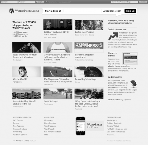
Jeff has brought to my attention that folks at Automattic are testing a redesign of the WordPress.com front page.
Those arriving at WordPress.com front page are either from other blogs hosted on WordPress.com or search engines, and most of them are interested in creating a blog for themselves. Those who want to explore featured posts are mostly the existing users. Therefore, I suggest to:
- make the sign-up area more prominent, and
- featured posts more easy to scan.
Here is a greyscale mock-up of what I mean with the first suggestion:
What do you think?
